We’ve written about color theory before (‘I’ve Got the Blues…’), and with spring’s hysteria now receding into summer, gardening life has calmed down enough that it seems a good time to revisit some of the basic principles that we can use to create striking and harmonious garden moods. Remember, foliage generally endures much longer than floral displays, so getting the foliage colors right has a more lasting impact than pairing flower combinations.
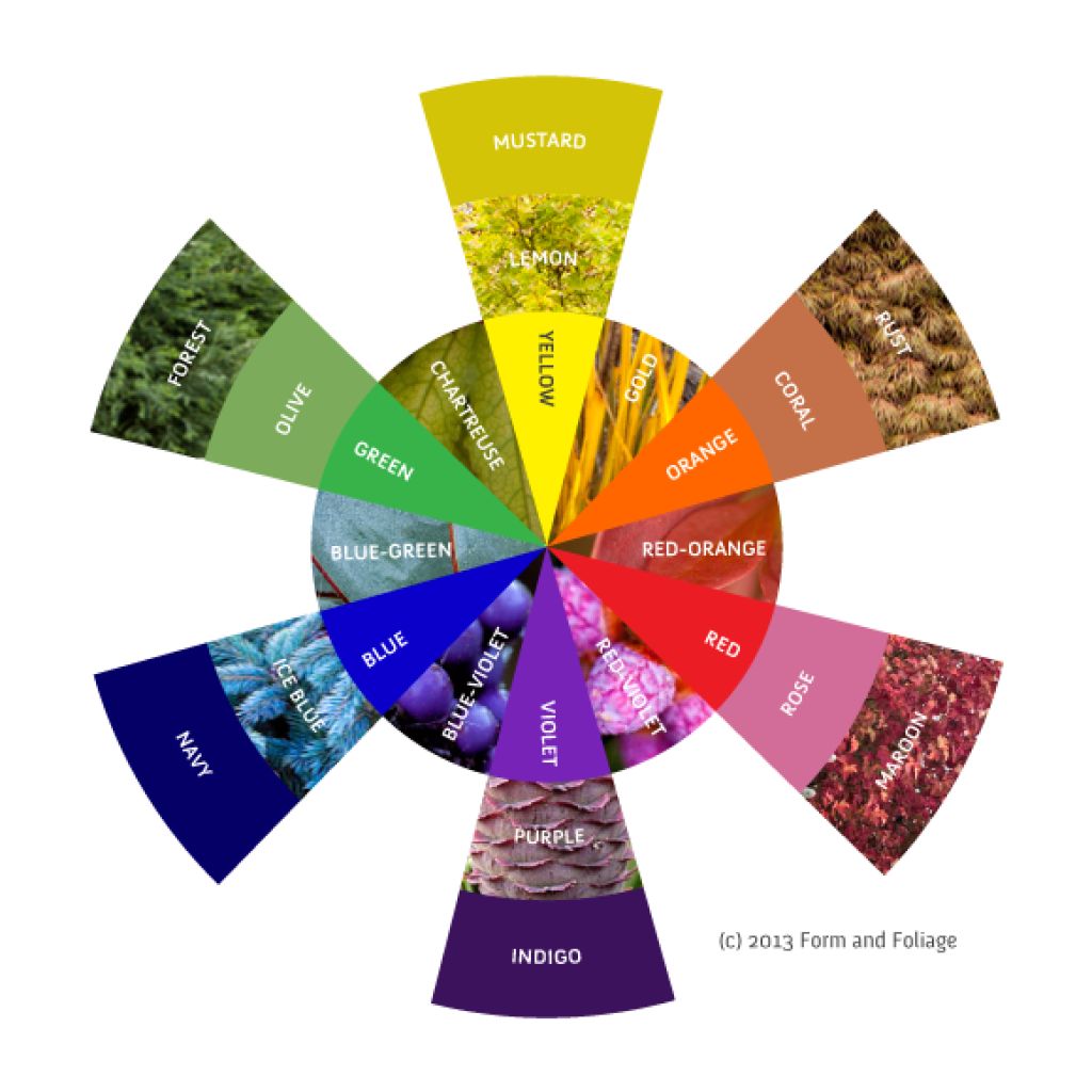
Generally, the most dramatic combinations are achieved by pairing complimentary colors – those that are opposites (across from each other) on the color wheel, such as red and green, blue and orange or yellow and purple. These dramatic moments work best as exactly that – moments. A garden composed entirely of pairs of complementary colors would almost certainly be too strident for most tastes. Color wheel opposites, such as red and green, however, are striking and energizing in small doses, as in the leaves and bracts of Leucadendron ‘Jester’, here backed by Cupressus nootkatensis‘Green Arrow’, which ably echoes 'Jester's green tones.
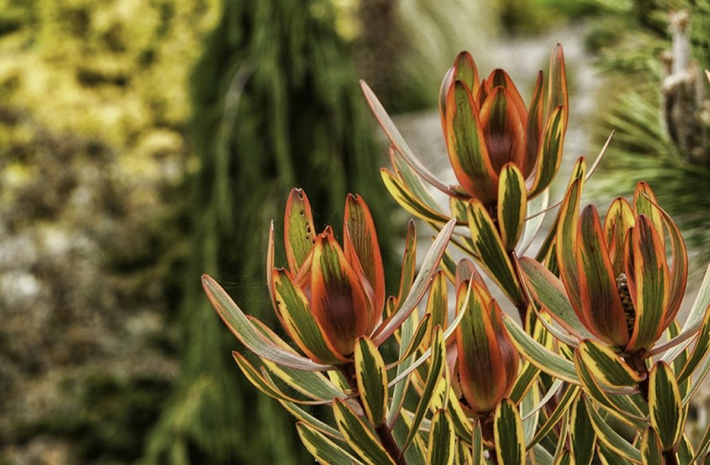
In the far background is Acer palmatum ‘Mizuho Beni’, which not only repeats 'Jester's yellow, but soothes its dramatic stripes, by teaming with ‘Green Arrow’ to provide what is termed an ‘analogous pairing’ of yellow and green. Analogous colors are those that are next to each other on the color wheel, such as yellow and green or blue and purple. See how the green and yellow soften the ‘Jester’s bold colors? Of course that splash of yellow in the leaves is an added bonus in the matching scheme!
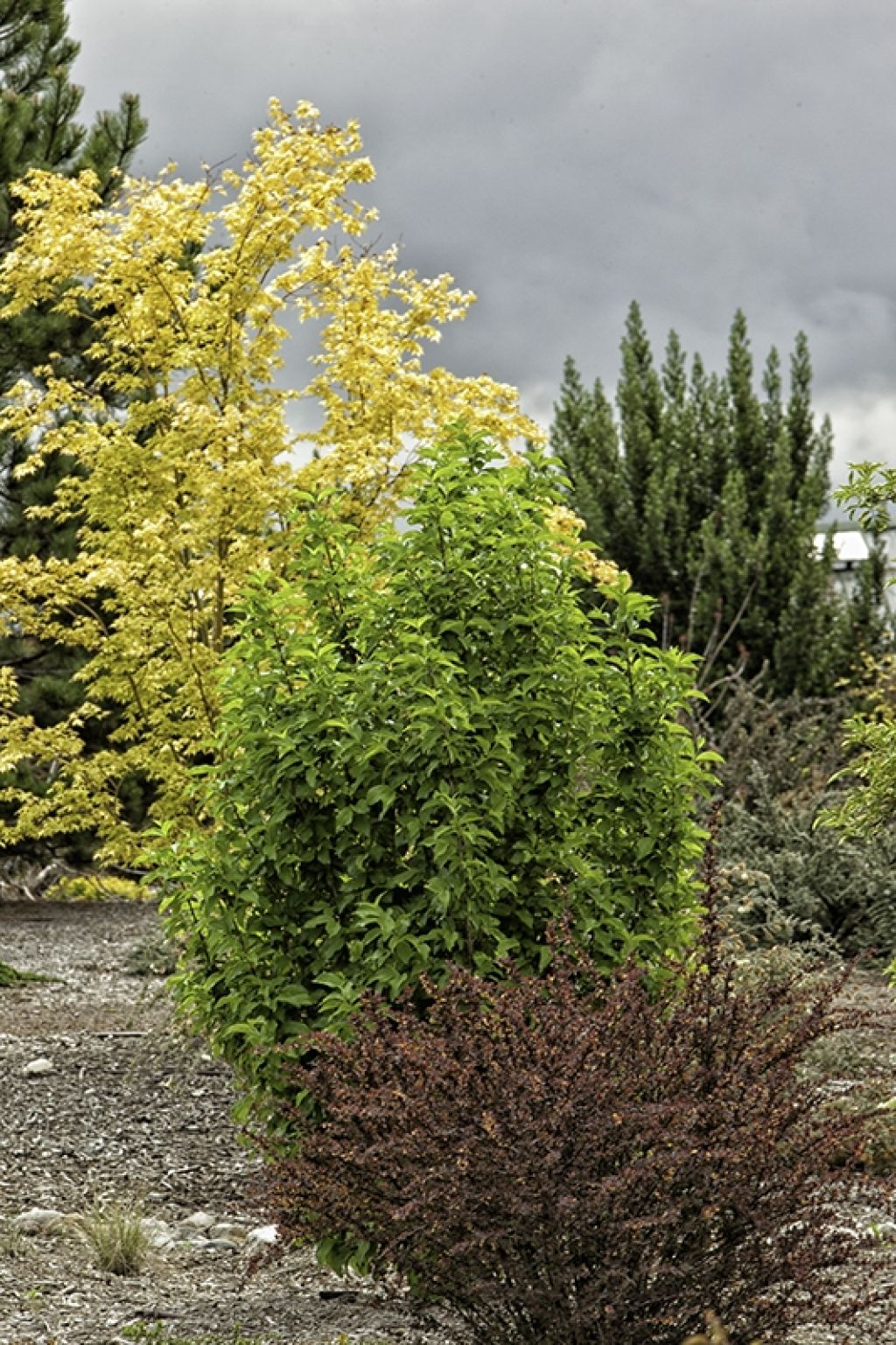
‘Mizuho Beni’ is paired on its other side with its color analog, the lovely green Cornus mas ‘Spring Glory’ (truly stunning in flower, but pulling its weight as a foliage plant in late spring/summer and into autumn). By backing the maroon Berberis thunbergii ‘Rose Glow’ with the analogous color pair of green and yellow, the drama is muted and kept from stridency and harshness.
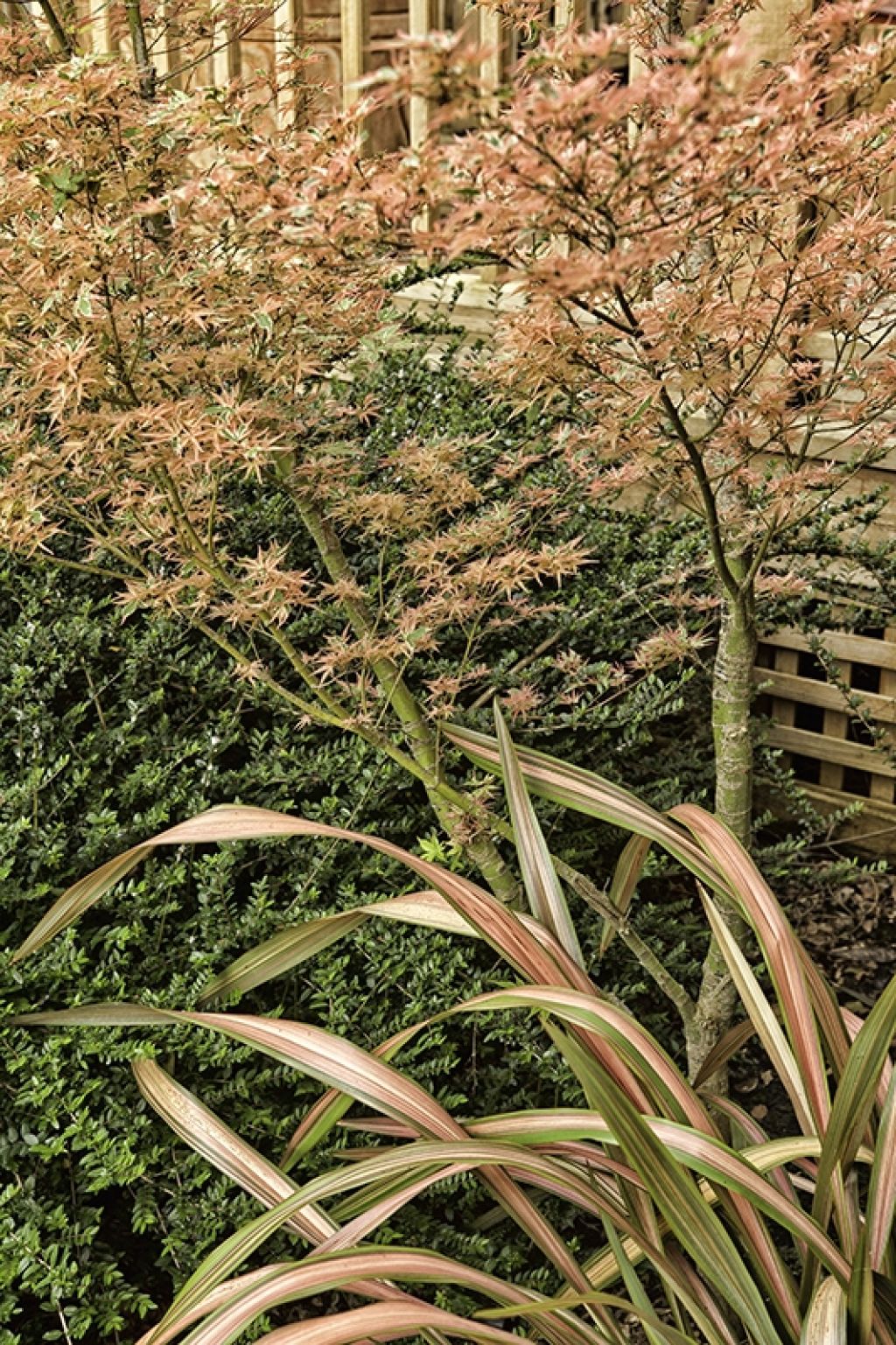
When white is added to any color the resulting hue is said to be a ‘tint’, and is generally more subdued and of lower impact. However, nobody told this Acer palmatum ‘Beni Schichihenge’ and Phormium ‘Jester’ that! This pink/green combination is a variation on the complimentary color pairing of red and green - softer, but with its own kind of drama. By not tinting the green (i.e. keeping the green shade of the Lonicera pileata deeper than the pink of the other plants) the resulting combination retains structure and strength.
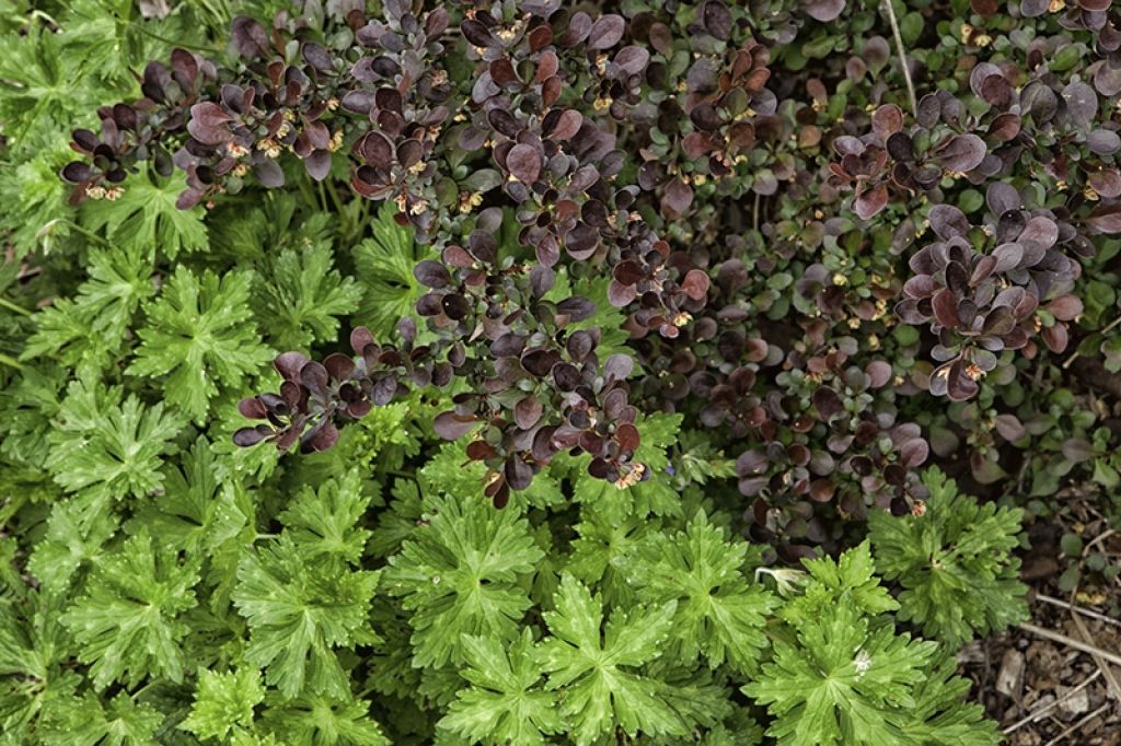
Adding black instead of white produces a shade, rather than a tint, and, with red, in practical terms gets you maroon instead of pink. This pairing of two extremely well known plants, Berberis thunbergii atropurpurea ‘Nana’ (common barberry) and Geranium ‘Rozanne’, doesn’t need flowers to provide pizzazz. Note that here, with the darker red shade, the slightly lighter green allows for contrast and brightness.
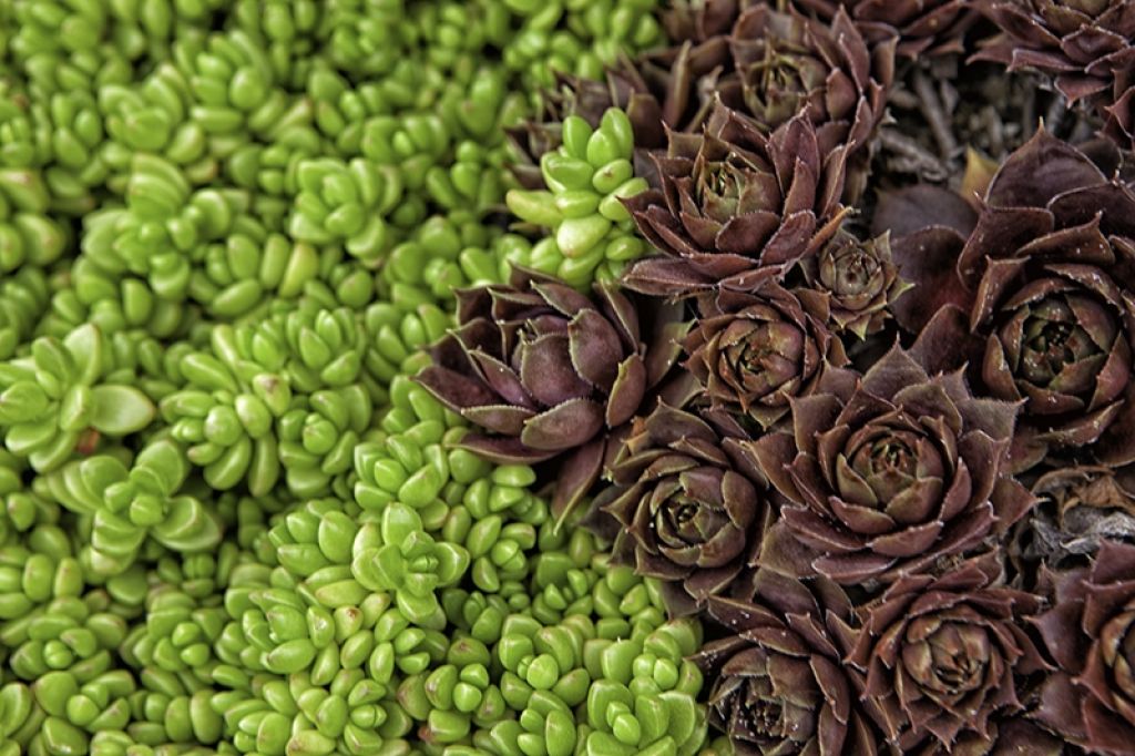
The same effect can be achieved using succulents, in this case Delosperma nubigenum, with a light, crisp green leaf and Sempervivum tectorum 'Red Beauty'.
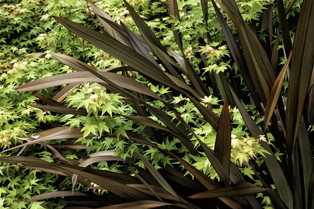
Adding gray (a mix of black and white) to any color creates a 'tone', and takes maroon to brown, and Phormium tenax ‘Jack Spratt’ is a satisfying, rich cocoa. Again traveling to the opposite side of the wheel for the complementary color, we find that an even lighter green works best, in this case the chartreuse-hued Acer palmatum ‘Capersi’s Dwarf’. Bonus points for its red-margined leaves and the great textural contrast between the two plants!
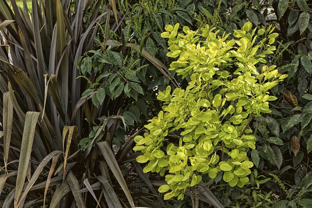
Another brown Phormium, P. ‘Dusky Chief’ pairs well with any number of light green or chartreuse-leaved shrubs, such as Cotinus ‘Ancot’, here buffered by the deep green of Prunus lusitanica. If you haven’t got space for such large shrubs, try the same color grouping using smaller Phormium varieties and perennials such as Heuchera.
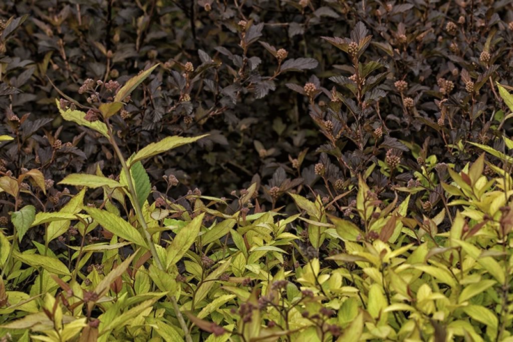
A different mood is created using reddish brown with its next-door neighbor, apricoty-gold. Lighter, brighter, and producing a pairing with less tension and impact than one made up of complementary colors, Physocarpus ‘Mindia’ (sold as Coppertina) and Spirea ‘Goldflame’ make a soft, mouthwatering combination for the months both pre- and post-bloom.
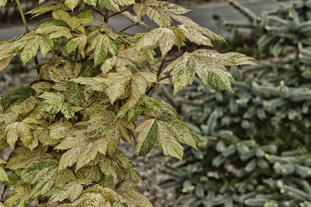
Another analogous combination is pink and powder blue (the tints of red and blue). In this case, Acer pseudoplatanus‘Esk Sunset’ is paired with Picea pungens ‘Fat Albert’. Both tints are soft and undemanding, yet result in a pairing both rich and satisfying.
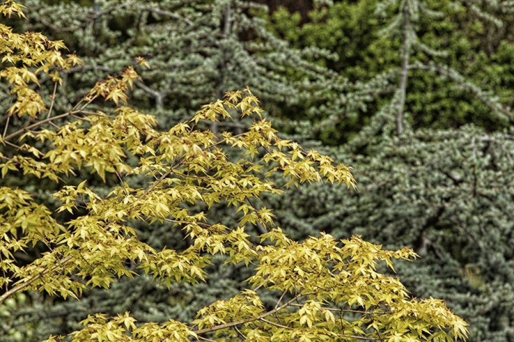
Technically a triadic combination, (three colors that are spaced evenly around the wheel), this yellow leaf (our friend ‘Mizuho Beni’ again) with its red stem floats in front of the powdery blue Cedrus libani var. atlantica ‘Blue Cascade’. The most successful triadic combinations feature one dominant color, in this case yellow, accented by the other two. The yellow displays more richness backed by the soft blue than it would if paired with green.
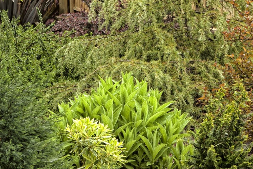
Finally, see what happens when color combinations are narrowed to the tints, shades and tones of only one color, in this case the ‘cool’ color green. This restful grouping of foliage would lack definition and impact if it were not for the wide variety of leaf sizes, forms and textures. Combining broad-leafed evergreens (Lonicera pilleata top left, Pieris japonica‘Silver Flame’ lower center); conifers (Chamaecyparis lawsoniana ‘Barry’s Silver’ lower left, Chamaecyparis obtusa‘Golden Fern’ lower right, Cedrus deodara ‘Silver Mist’ upper right/center) and the perennial Lobela tupa, this display is calming and serene 10 months of the year, only interrupted when the Lobelia blooms dramatically in summer and succumbs to frost for a month or so in the depths of winter.
So decide what mood you’re looking for – if it’s drama, go for complementary colors, if it’s calm, try analogs and if you are game to try something more complex give a triadic combination a whirl - and take your color wheel to the nursery on your next visit!
Copyright 2012 by Form and Foliage